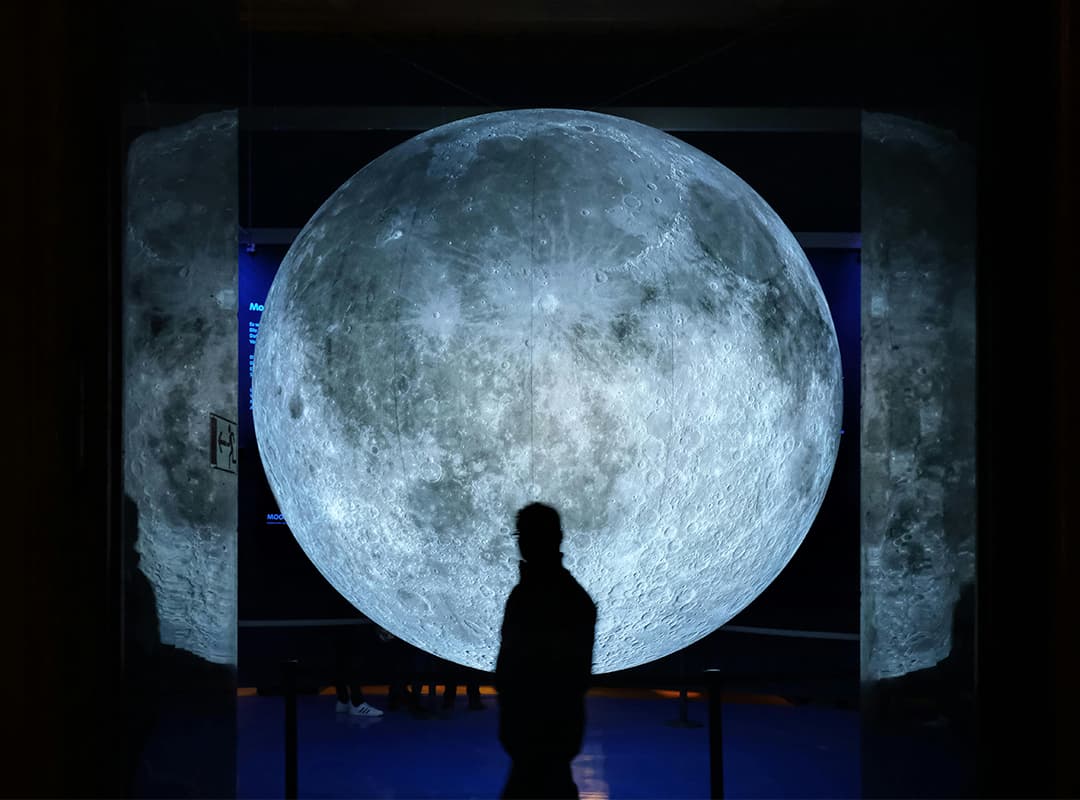
In most works of art, your eye is drawn to the main point of focus, but the area around that object is just as important. This is called space, and it is one of the fundamental elements of art. Below, we discuss the differences between positive and negative space in art and provide examples of different ways artists use space in their compositions.
What is space in art?
Let’s start with the definition of space in art: it is the area around and within objects, shapes, colors, and lines. Space is one of the seven elements of art. In general, there are two main types of space in art: positive and negative.
Positive space refers to the area of interest in a work of art: trees in a landscape, a person in a portrait, a bowl or a piece of fruit in a still life.
So, what is negative space in art? It is the space around and between objects, not the object itself.
Artists strategically use positive and negative space in art to create effective images, convey messages and meanings, create balance, and draw attention to an intended focal point. An artist’s use of space can also add depth and perspective by creating the illusion that some objects are larger or closer than others. Without space, the composition can become too cluttered to effectively convey the intended meaning.
What does space mean in art? It depends on how the artist decides to use it. Some artists may include large spaces between objects, conveying a sense of isolation. Others may group objects close together, communicating that they have a strong connection.
Artists can also use positive and negative space in art to achieve interesting visual effects and draw attention to the intended area of the composition. Check out the examples below to see how several different artists have chosen to use space strategically in their artwork.
Instead of drawing intended shapes, you can use negative space to define them. In this example, the artist didn’t draw lemons first. Instead, she created a yellow watercolor background and then used a white paint marker to add the negative space that formed the lemon shapes.
When you create illustrations with intentional negative space, you can add other elements like text later. This botanical design has an empty center, which is perfect for highlighting a phrase or word.
You can also use negative space to form words and letters. Instead of drawing the word itself, you essentially draw or paint around the word, creating a colorful background, while the letters remain white.
In art, space can – and should – be an intentional element of every composition. Experiment with different ways to use space and you’ll be amazed at how you can elevate your artwork.
